LeoDerm Look

Our task was to design a corporate logo and identity for a cosmetological centre by the well known dermatological clinic LeoDerm in Lviv (Western Ukraine). All cosmetological treatments in the centre are conducted by professional dermatologists, which makes the clinic unique. The logo was designed to look elite but with feminine refinement.

Solution: delicate design embraces the face in a mirror - reflection of the beauty each woman seeks to find in it.

LeoDerm Look

Mini Mio

Prior to introduction of Mini Mio to the wholesale market of goods for children, we had to come up with the brand name, corporate logo and website.

Solution: brand required a live, vivid and cute character to support the name we have chosen for Mini Mio (means ‘my little’ in Spanish). And what can be more cute that a puffy smiling unicorn? :-)

Mini Mio

Working on the whole project from scratch our team also developed a corporate website in the same visual style as the brand’s logo. Mini Mio.

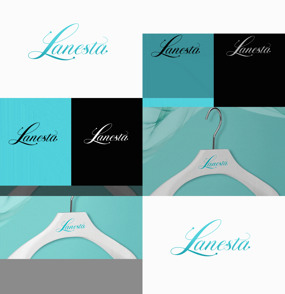
Lanesta

In this case we had follow the succession of the already existing logo of the international wedding dress brand and give it a romantic character.

Solution: to communicate brand’s character we have chosen a rhythmic, but light and romantic-looking font. Our intention was not to change the existing logo completely but to keep it recognizable for old customers.

Lanesta

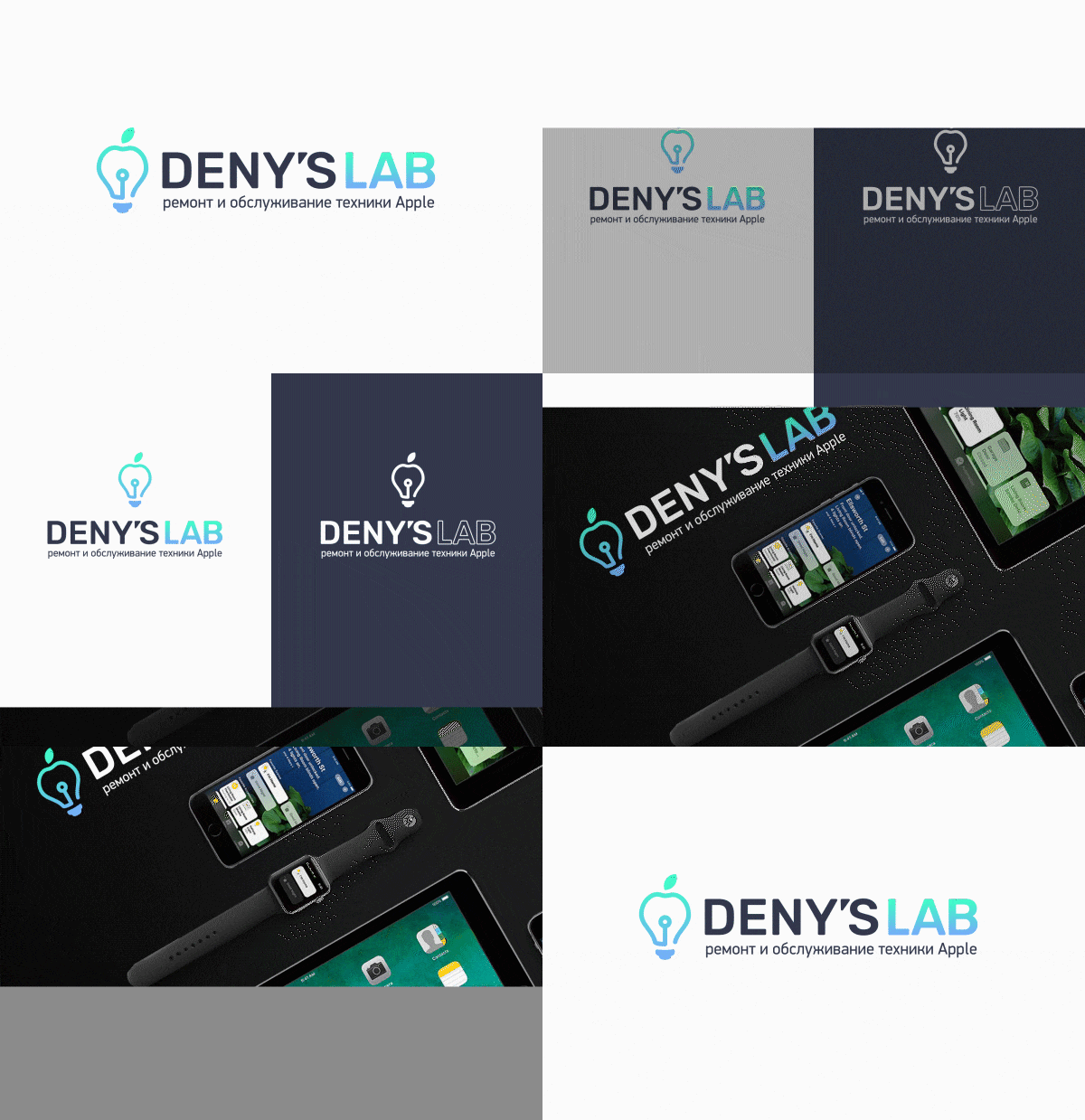
Deny’s Lab

We had to design the logo, corporate identity and develop the website for specialized Apple technical service which tackles the most difficult repairs of brandy [Apple] devices.

Solution: the well known ‘fruit’ was substituted for a lightbulb as the symbol of ideas and solutions.

Deny’s Lab

Once the logo and corporate identity were approved we developed a website in the same visual style as the Deny’s Lab logo..

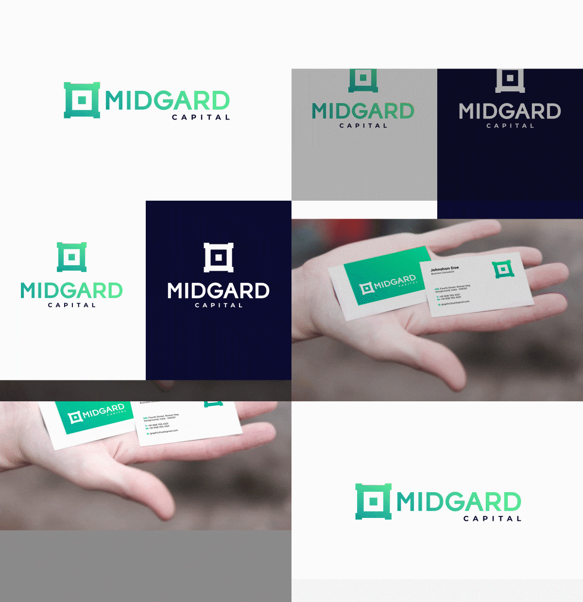
Midgard

‘We designed a logo as a part of the project while developing the website for a reliable investment fund established to save and multiply clients’ capital.

Solution: logo is a graphic representation of a fort that holds and protects something valuable inside.

Midgard

Later on this logo became a starting point for our team to develop the website with similar design as a part of the whole project for the Client.

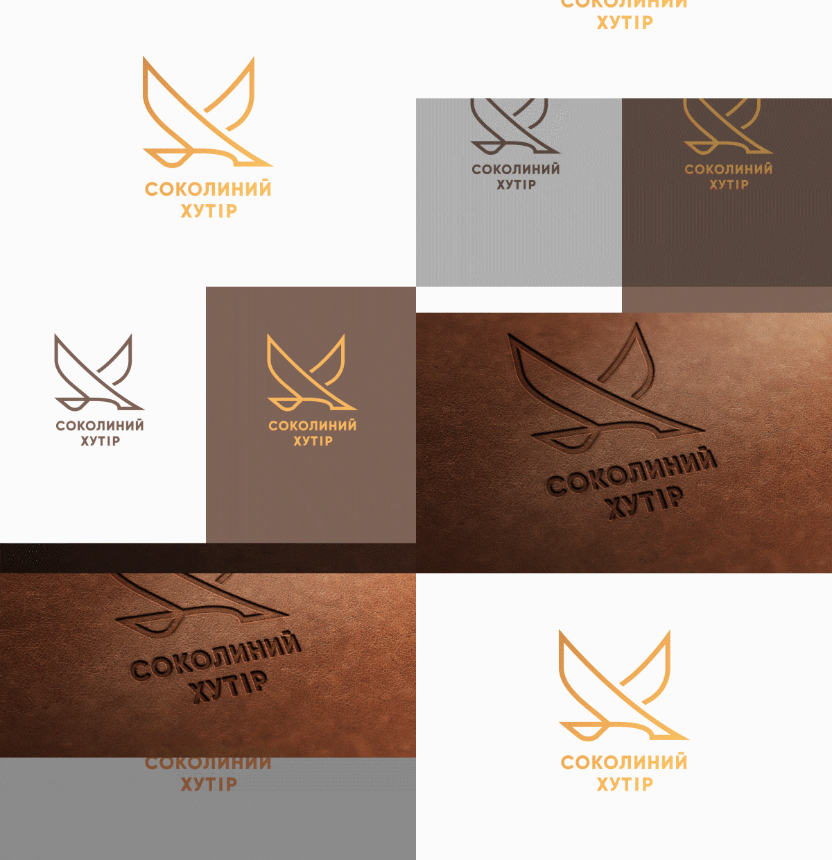
Sokolyny Khutir

Our Client runs an agro-tourism resort in Chernihiv region, which is built around Ukrainian authentic culture and history. It operates on the local eco-tourist market for 10 years now. Our team advised the Client to review the logo before we started working on the website for Sokolyny khutir.

Solution: the modern design of a logo represents an outline of a falcon as comes from the name and the origin of the Sokolyny khutir resort (meaning ‘falcon ranch’).

Соколиний хутір
Next example
Start cooperation
`